- Ingredient information is technical and difficult to evaluate at the point of purchase.
- Sites organise by inventory taxonomy, not by what users actually shop for.
- Hidden shipping fees, account walls, and multi-step forms break intent at checkout.
Case study · 03Role · UX / UI DesignerStatus · ConceptPlatforms · Responsive web · Mobile
Laurea.
A conceptual skincare and spa platform that treats ingredient transparency as the default and lets discovery feel calmer than checkout normally does.
01 · The project
The project at a glance.
Laurea is a self-initiated concept for a skincare brand where education, product discovery, and an in-person spa booking layer share one surface.
Current platforms expect users to translate ingredient lists, parse percentages, and reconcile contradictory routines on their own. Laurea asks what happens when the brand does that translation work instead. The answer plays out across web, mobile, and a connected spa booking layer.
Deliverables
- 01User research synthesis + Maria Lopez primary persona
- 02Information architecture · seven-surface map
- 03Lo-fi wireframes · web & mobile
- 04Brand & visual language documentation
- 05Hi-fi screens · web & mobile
02 · ProblemProblem Solution 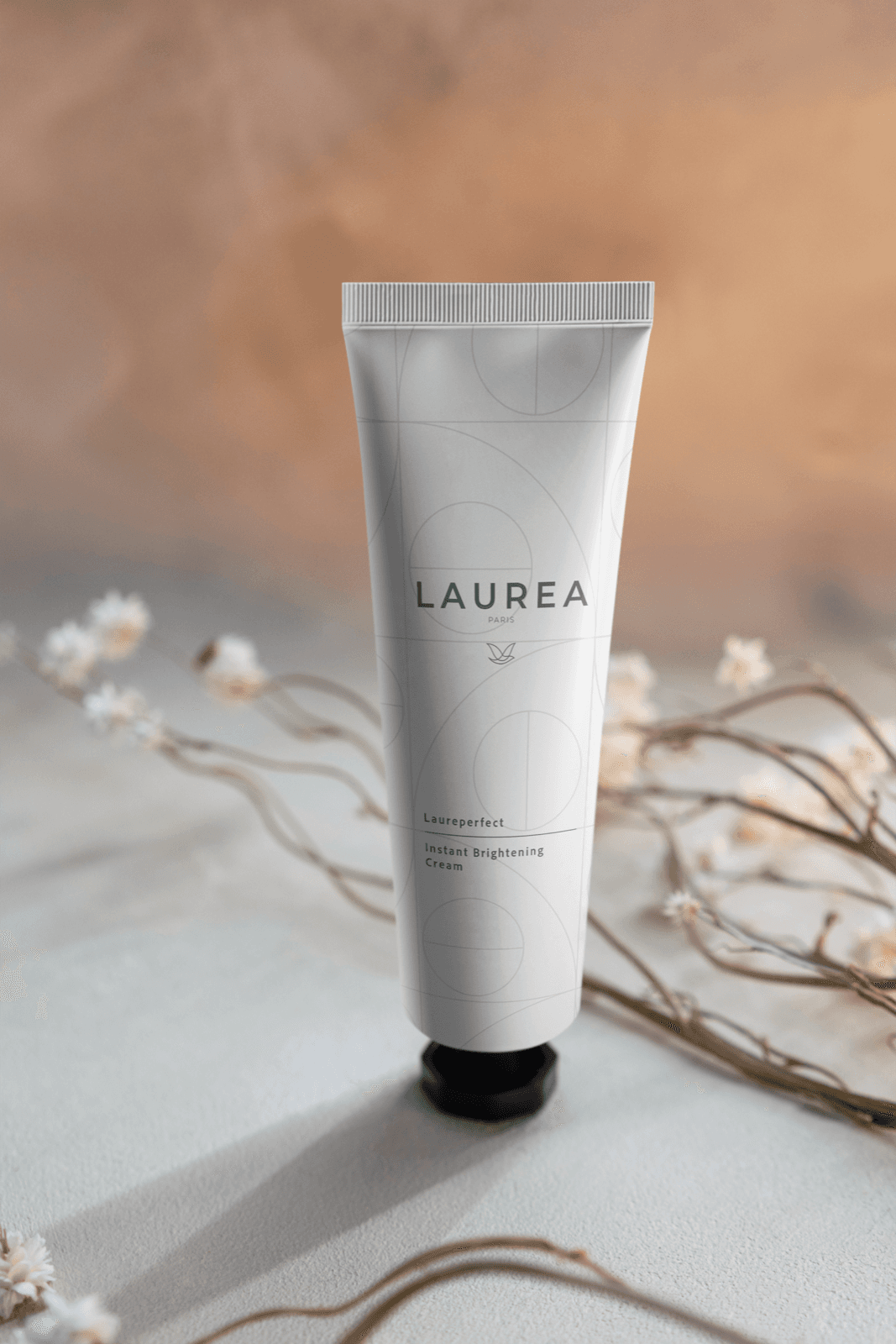
From problem to solution.
Laurea is a brand that simplifies skincare shopping through a clearer, more trustworthy, education-led experience.
- Key ingredient cards spotlit on the product detail page with plain-language descriptors.
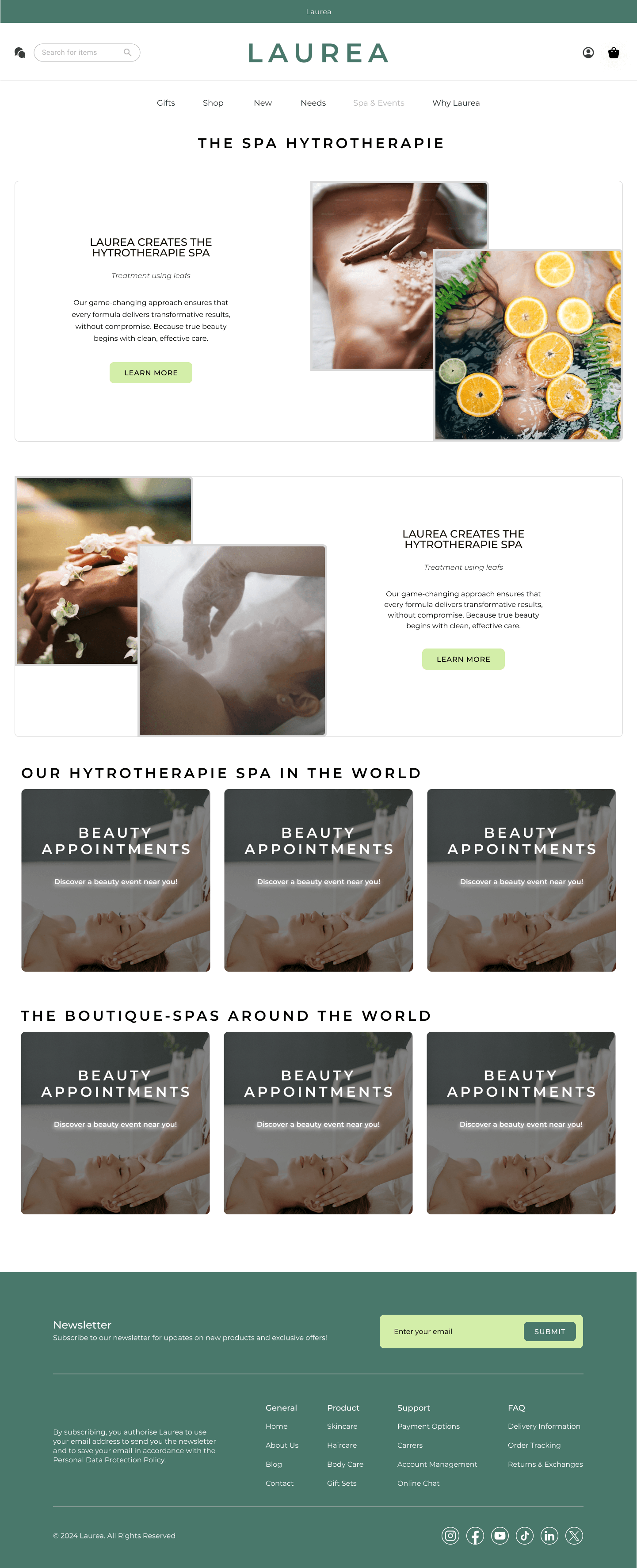
- Information architecture reorganised around user intent: Gifts, Shop, New, Needs, Spa & Events, Why Laurea, Footer.
- Open, filterable reviews and efficacy stats let trust build before checkout.
- A unified surface for shopping and spa booking, kept neutral and free of urgency tactics.
03 · Research
How we listened.
I ran an online survey paired with one-on-one interviews across twelve participants. The goal was to surface the lived friction beneath the headline metrics: cart abandonment, search drop-off, mobile bounce.
Initial assumption: users wanted faster checkout and less information. Actual finding: they wanted more information, translated, and a checkout that earns their trust without asking for an account first.
“I want to know what’s in it. Not just the marketing words on the front.”
Competitive benchmark · anonymised
- Competitor AEstablished e-commerce platformStrength
Brand trust, AI-powered recommendations, polished checkout
GapOvercrowded UI, limited accessibility, dense product trees
- Competitor BMobile-first shopping appStrength
Mobile fluency, PWA support, social commerce integrations
GapPoor search and filters, weak desktop, slow support
- Competitor CNiche curated marketplaceStrength
Specialist curation, community-driven trust, narrow but deep catalogue
GapLimited scalability, no personalisation, high seller fees
- Participants
- 12
- Ages
- 22 – 38
- Benchmark
- 03
01
New and returning shoppers. Online survey plus 1-on-1 interviews.
02
Mixed gender, mixed device habits, mixed shopping intent.
03
Anonymised competitors across mass, niche, and mobile-first beauty.
04 · Persona
A busy professional who wants the app to earn her time.
Maria Lopez
Digital Marketing Specialist
28 yrs ·Barcelona ·High intent buyer
Frequent online shopper. Discovers new products often, but loses patience with cluttered navigation and forced account creation. Shops primarily on her phone in short bursts between meetings. She wants to feel informed, not sold to.
Goals
- +Filter products by what she actually needs
- +Move through checkout without registering
- +See personalised recommendations that save time
- +Trust ingredient and sustainability claims at a glance
Frustrations
- -Complicated navigation, buried filters
- -Slow mobile load and laggy interactions
- -Generic recommendations that miss her skin
- -Hidden shipping costs surfaced only at checkout
“I don’t have time to translate ingredient lists. Tell me what’s in it, what it does, and what other people thought.”
Behaviour
Mobile usage
Time pressure
Brand exploration
Repeat purchase
Devices
70% mobile / 30% desktop
Payment
Apple Pay, Google Pay
Empathy · Says · Thinks · Does · Feels
- Says
- ·“I want trust before checkout, not after.”
- ·“I’ll skip a brand if its labels feel like marketing.”
- Thinks
- ·Will this product actually fit my routine?
- ·How do I know which ingredient is doing the work?
- Does
- ·Researches at night, buys on mobile.
- ·Reads ingredients and reviews before adding to cart.
- Feels
- ·Overwhelmed by category density.
- ·Sceptical of urgency framing and badges.
05 · Journey
Six moments, one purchase.
Mapped Maria’s loop across actions, emotions, touchpoints, pain points, and opportunities. The matrix made it obvious that the biggest design wins lived in Consideration and Purchase, not in awareness theatre.
01Awareness
02Consideration
03Decision
04Purchase
05Delivery
06Post-purchase
Customer actions
- Sees an Instagram ad about sustainable skincare
- Reads a blog about clean beauty
- Watches influencer reviews on TikTok
- Searches for eco-friendly skincare products
- Browses Laurea’s website
- Reads customer reviews
- Takes the personalised skincare quiz
- Signs up for the email newsletter
- Identifies the routine that fits
- Uses a discount code received via email
- Adds recommended products to cart
- Contacts customer support for questions
- Completes purchase
- Receives order confirmation email
- Tracks the order
- Receives order
- Unboxes and tries the product
- Receives a follow-up email requesting a review
- Shares on Instagram or TikTok
- Joins Laurea’s loyalty program
Emotions
- 😐 Curious, interested
- 😕 Sceptical about greenwashing claims
- 😐 Interested but unsure
- 🙂 Finds appealing products
- 😀 Excited to buy
- 😟 Worried if it suits their skin
- 😀 Happy but anxious about delivery
- 😀 Excited
- 😌 Relieved if product meets expectations
- 🥰 Satisfied, proud
- 🥰 Loyal to the brand
Touchpoints
- Social media ads
- Influencer videos
- Blog articles
- Website
- Customer reviews
- Skincare quiz
- Email newsletter
- Product page
- Checkout
- Customer service chat
- Cart
- Checkout
- Order confirmation
- Order confirmation email
- Shipping notification
- Delivery moment
- Follow-up email
- Social media
- Loyalty program
Pain points
- Overwhelmed with too many brand choices
- Unsure if products are truly sustainable
- Difficulty understanding product benefits
- Hard to compare sustainability impact
- Confusion about skincare ingredients
- Concerns about price vs. value
- Long estimated shipping time
- No clear tracking updates
- Packaging damage concerns
- Unclear usage instructions
- No clear incentive to repurchase
- Weak community engagement
Opportunities
- Clear transparency labels
- Impact statistics on product pages
- AI-powered personalised recommendations
- Verified customer reviews
- Ingredient education tooltips
- Live chat with skincare experts
- Real-time order tracking
- Sustainable packaging details in emails
- Eco-friendly packaging awareness
- Personalised how-to-use guide
- Exclusive referral discounts
- Loyalty program with VIP perks
Five of the twelve opportunities landed as design moves: ingredient education tooltips, verified customer reviews, transparency labels, and impact statistics all live in Ingredients; eco-friendly packaging surfaces through the refill cue in Brand. The other seven sat as scope I flagged for a future iteration.
Scroll horizontally to see all six phases
06 · Root cause
Why does this keep happening?
A 5 Whys pass on cart abandonment, the loudest drop-off. Each step back ended at a data-collection-first business model. Two parallel friction points, slow mobile load and weak findability, surfaced in the same exercise with their own root-cause summaries.
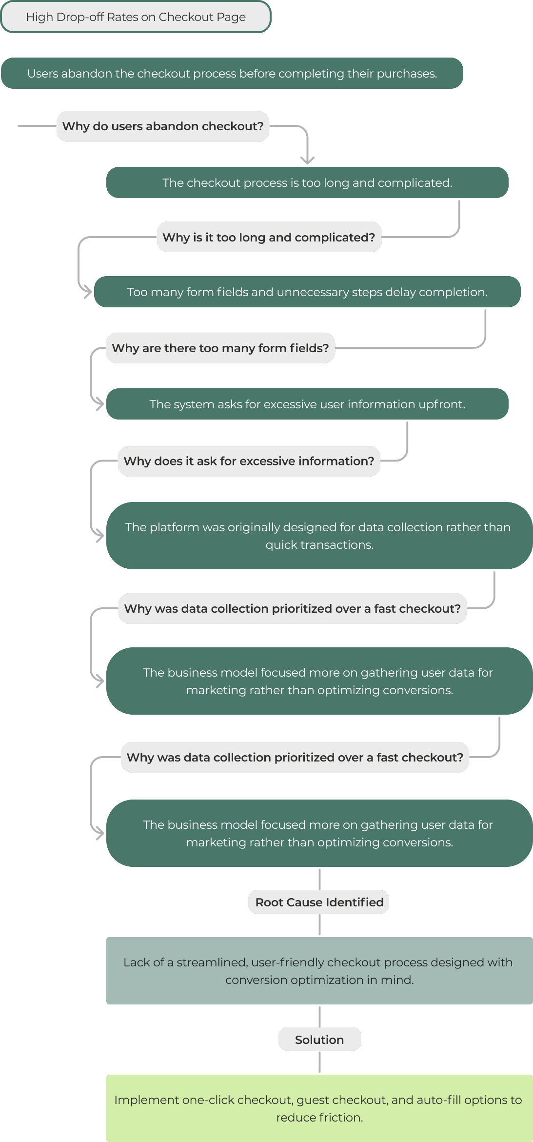
- Problem · 01Slow mobile load
Root
Unoptimised images and scripts, no CDN, no lazy loading on dense product pages.Solution
Image pipeline overhaul, lazy loading, content delivery network on the critical path. - Problem · 02Users can’t find products
Root
Search and filters mirror inventory taxonomy instead of skin concern language.Solution
Concern-first filters, predictive search trained on the language users actually use.
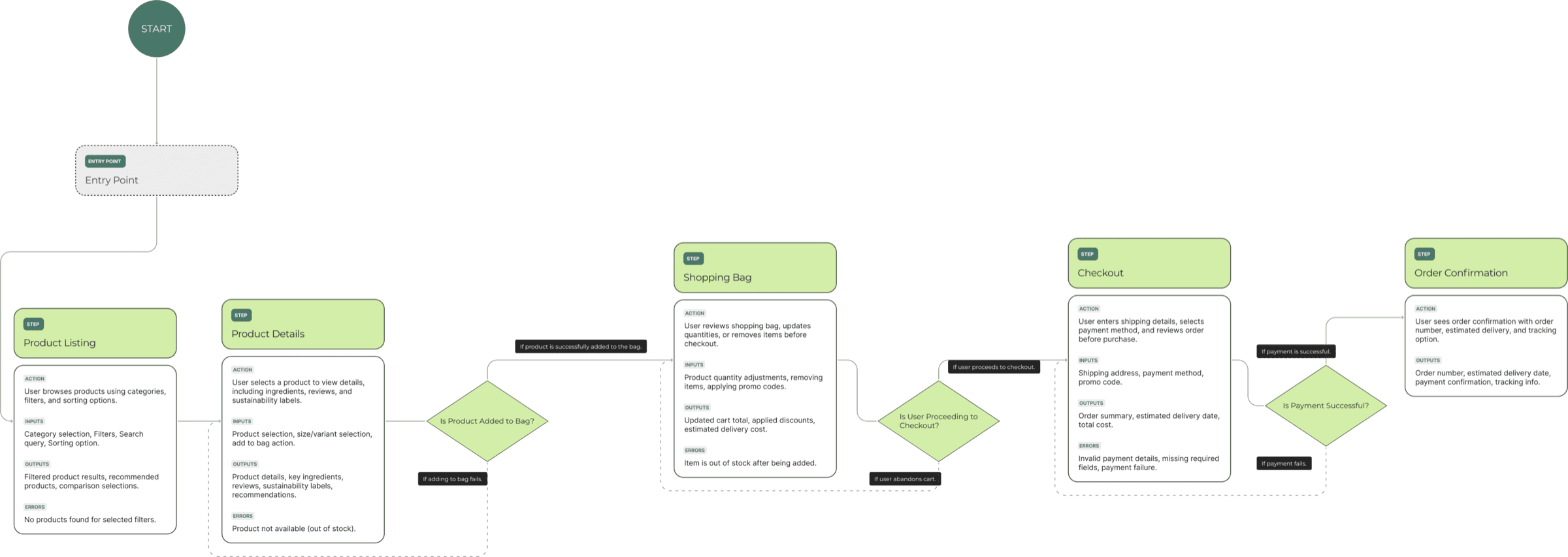
07 · User flow
From browse to confirmation.
The end-to-end flow traces entry to order confirmation, with the moments most likely to lose a user marked: product list, bag, and checkout. Each step lists its inputs, outputs, and error states so engineering and copy can move together.
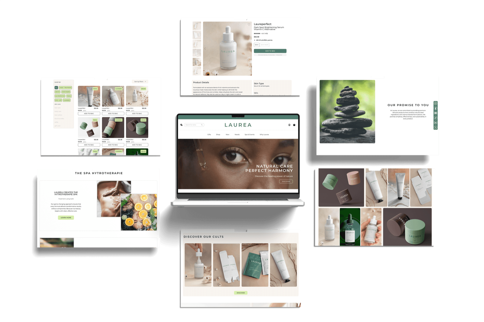
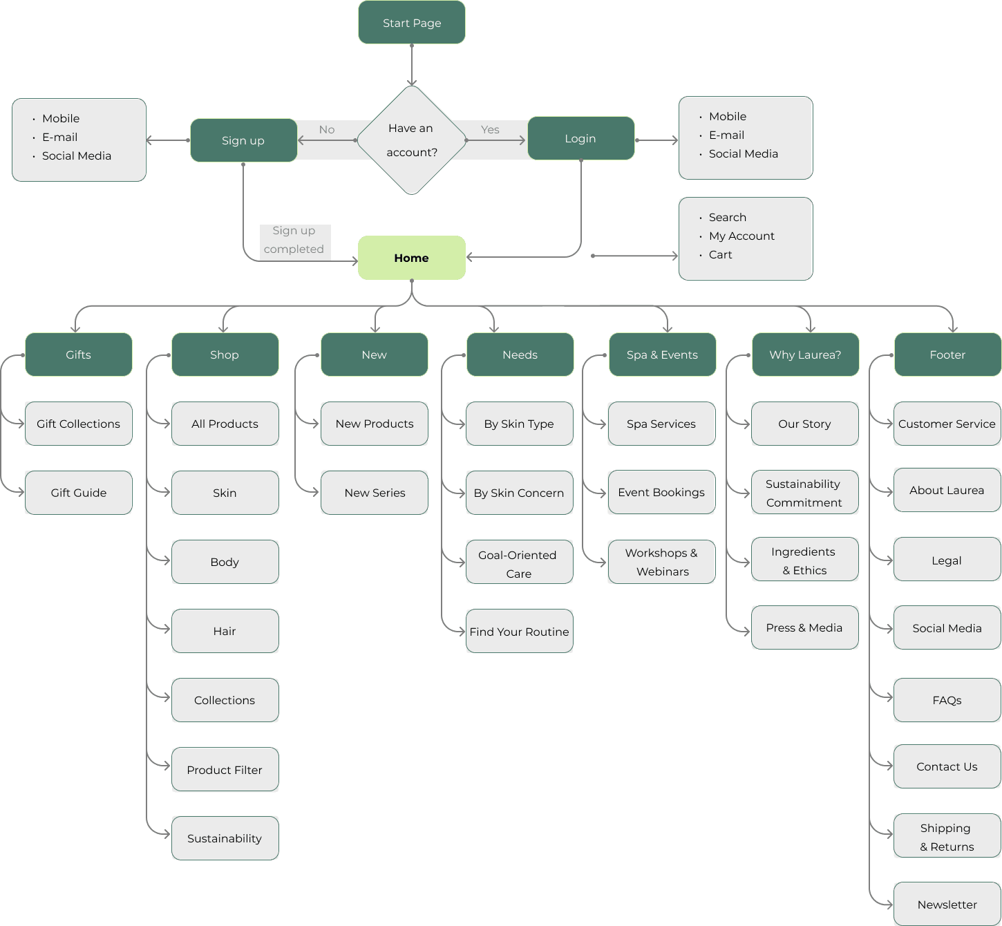
08 · Architecture
Seven surfaces. One home.
Auth lives at the entrance and stays out of the way. Home pivots into seven surfaces, each with its own job: gifting, shopping, what’s new, skin needs, spa and events, brand story, and supporting links. No primary nav longer than a glance.
09 · Wireframes
Layout before look.
Hierarchy decisions made in greyscale survive the brand layer. Filters anchored to the left, ingredients pulled forward, education sitting one click away from intent.
- Greyscale · structural only
- Hierarchy locked before colour and copy
- Mobile mirrors web for routine surfaces
 HomeHero + showcase · greyscale
 ShopFilter + grid · greyscale
 Product detailHero + buy + reviews · greyscale
 Spa & EventsBooking + agenda · greyscale
10 · Brand
Calm enough to trust before reading a word.
Skincare brands tend to look either clinical or trendy. Laurea sits between: editorial neutrals, sage and cream, a calm mint accent. Montserrat italic for voice, regular for instruction.
Palette
- Sage#3F5547Primary surface
- Sage deep#27332BHeadings, footer
- Mint#D3EEA9Active state, accents
- Cream#F1ECE0Paper, soft cards
- Charcoal#1F1F1FBody type
- Mist#D9DDD2Hairlines, dividers
Type
Natural care, perfect harmony.
- AaMontserrat · Display400 / 500 / 700
- AaMontserrat · UI & Body400 / 500 / 600
- AaRoboto · Numbers400 / 500
- Calm
Generous spacing, soft edges, no urgency cues. The UI should feel like a clean bathroom shelf, not a sales floor.
- Honest
Ingredient names spelled out. Sustainability not framed as a badge but as a context tag on the product.
- Considered
Type holds a single voice. Imagery is editorial. Photography earns the white space.
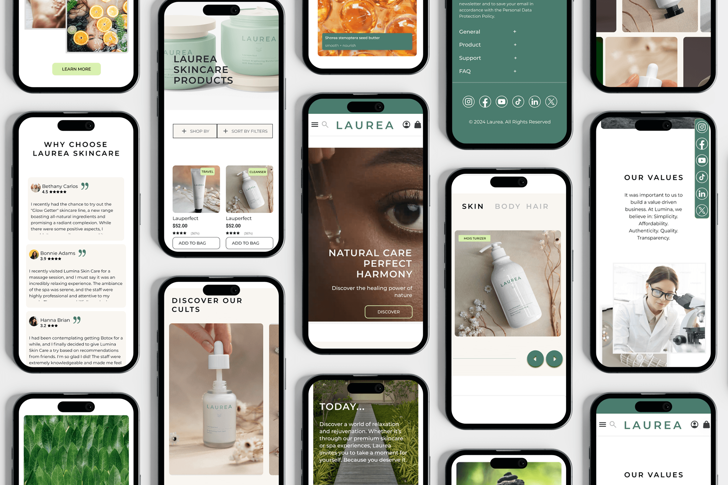
11 · Calm UI
A shop that doesn’t shout.
No countdown timers. No flash discounts. No urgency framing. Whitespace stays generous. Imagery breathes. The user arrives with intent; the UI rewards that.

Hi-fi prototype · in motionLoops · muted
- Home
- Shop
- New
- Spa & Events
- Why Laurea
- Sign-up
- Checkout
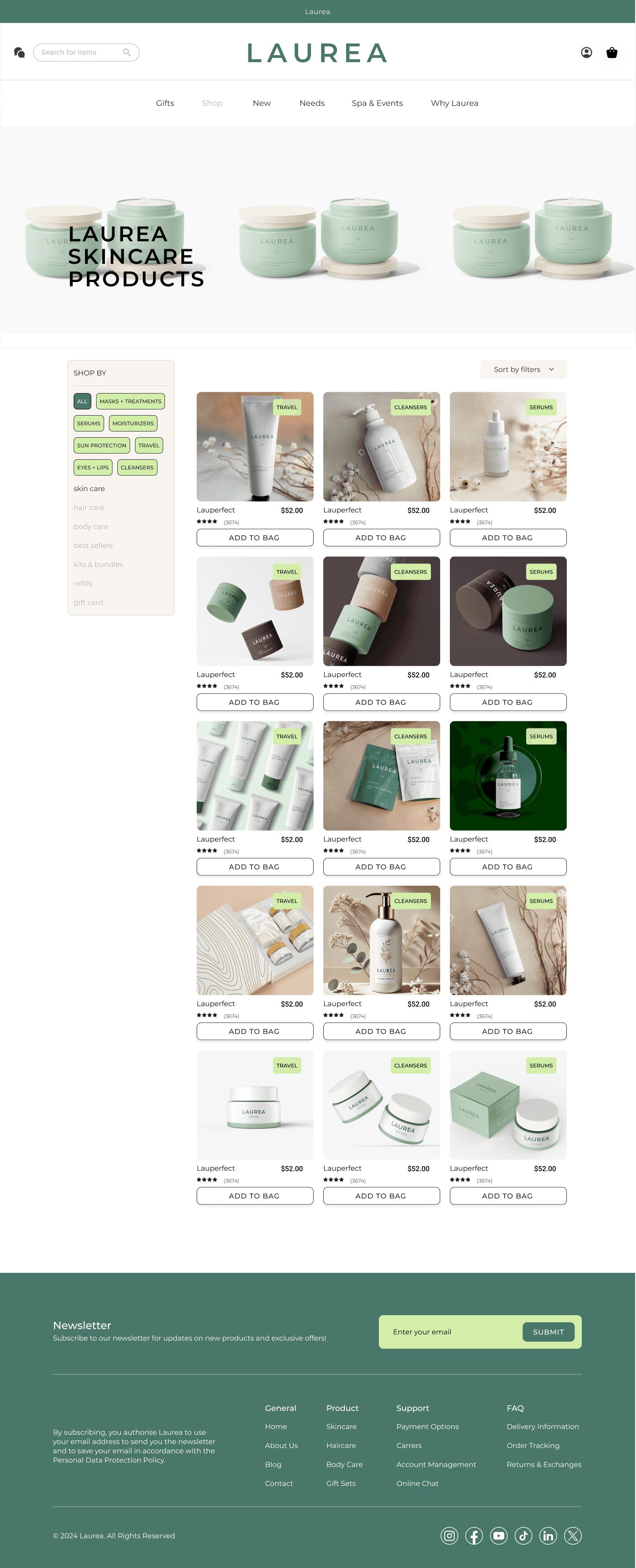
12 · Product detail
The product page does the work.
The product detail page is where the user decides. Three trust surfaces, in order: what is inside, what it does, what other shoppers say, with marketing language out of the way.
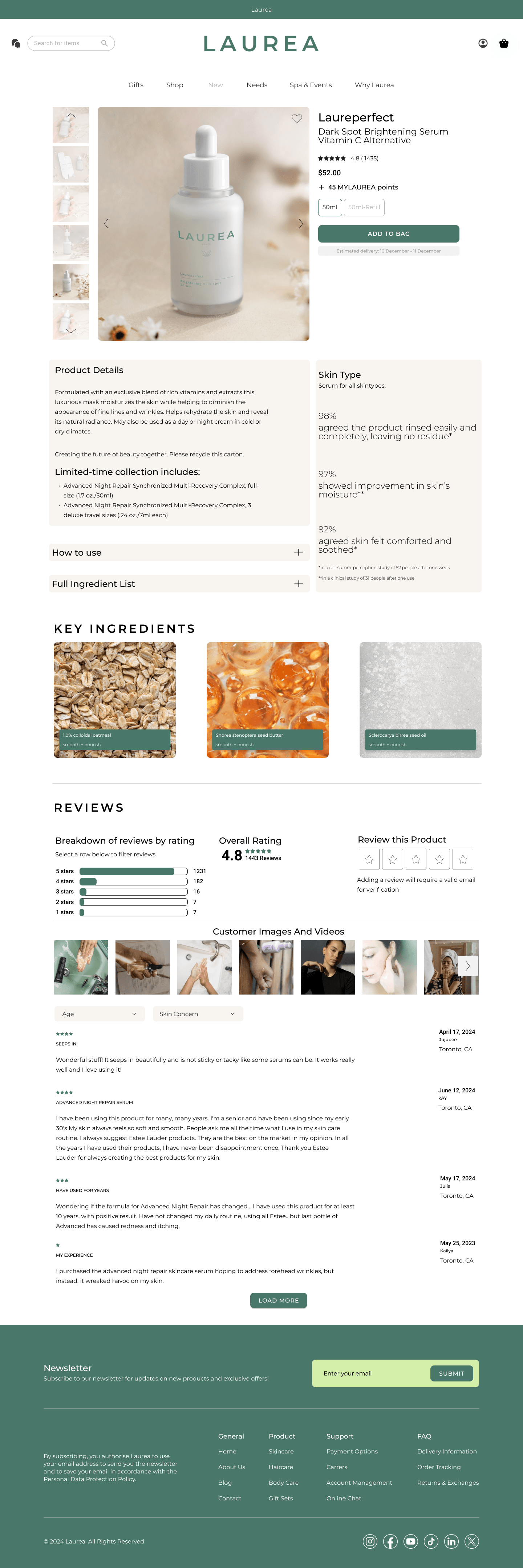
- 01Key ingredients, spotlit
Three named ingredients sit above the fold with photography and a one-line benefit. The full INCI list collapses into a row below for users who want depth.
- 02Efficacy in real numbers
Skin-type panel shows illustrative perception-study results (98% rinsed easily, 97% improvement, 92% comforted) so users see evidence, not adjectives.
- 03Open, filterable reviews
Rating breakdown, customer images, and review filters by age and skin concern. Trust built with other shoppers’ voices, not editorial copy.

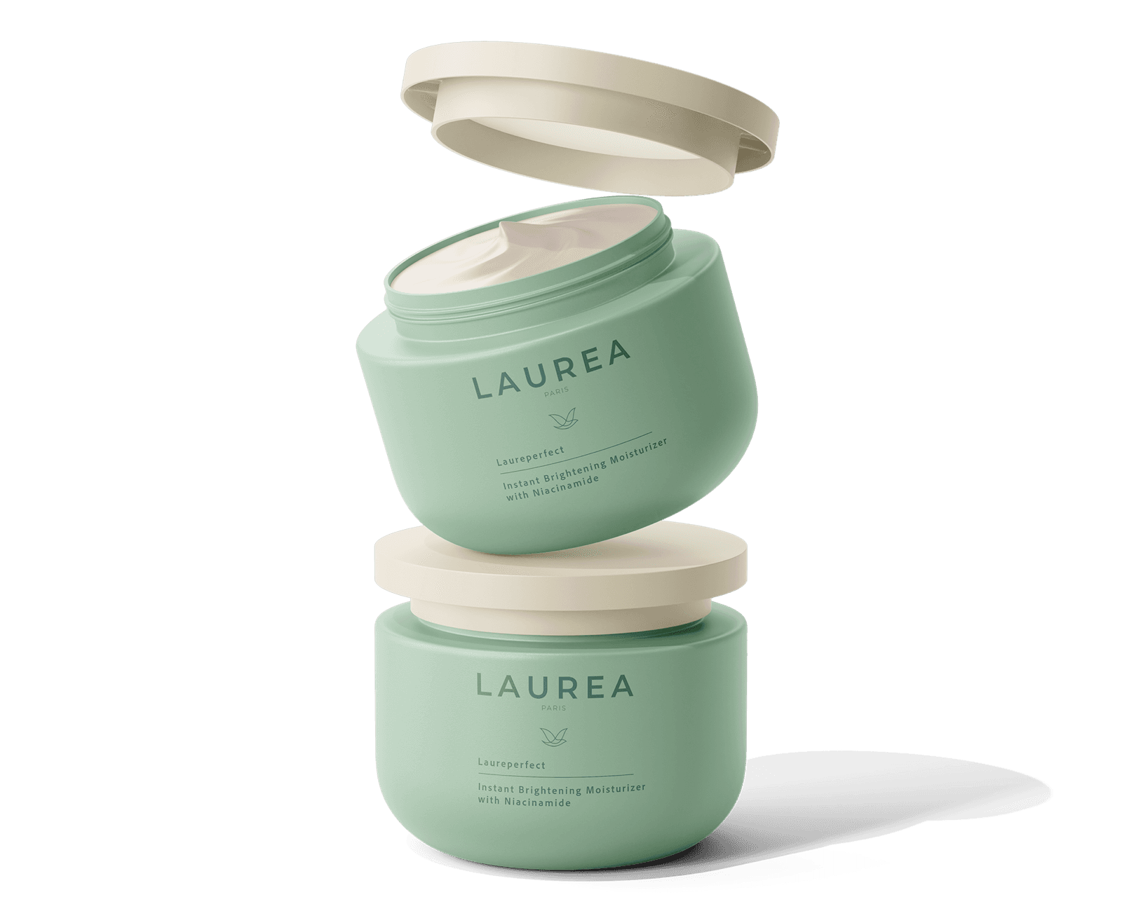
13 · In context
The brand off the screen.
A skincare brand has to feel coherent in the moment between interface and shelf. Product mockups extend the same palette, voice, and quietness into packaging and photography.
- Day cream
 Hydrating serum
 Body lotion
14 · Reflection
The gap between education and commerce doesn’t have to be wide.
The hardest part wasn’t designing more features. It was designing fewer, better-translated ones.
- Keep · 01
Trust is built before checkout
The strongest unlock wasn’t a new module; it was making the product detail page answer the questions users came with. Three named ingredients above the fold, efficacy stated as percentages, and reviews opened by default with age and skin-concern filters. The checkout step then had less convincing to do.
- Keep · 02
Calm is a design system
The strongest design choices were what didn’t ship. No countdown timers, no flash discounts, no urgency framing. Whitespace and soft contrast keep the eye on the product, not on the interface asking for something back. Calm reads as a structural decision here, not a styling layer.
- Keep · 03
Sustainability is context, not a badge
Eco-friendly choices sit inside the product information rather than on a separate marketing surface. Refill, ingredient sourcing, and packaging detail read as context tags on the product, not stamps. The aim was for conscious choices to feel like the default, not the upsell.
A skincare app can be the expert the user doesn’t have time to become. It has to be designed to listen first.