Case study · 02Role · UX / UI Designer · FE DevStatus · LivePlatforms · Responsive web · Desktop installer
ADK · Alternative Distribution Channel

Clarity for
systems that
never sleep.

ADK is the bridge between servers and clients. It collects, reports, and distributes every user request across financial infrastructure. When it breaks, everything breaks. The interface had to make that clear.

The ADK dashboard running on a laptop: the shipped real-time monitoring surface in context
01 · OverviewThe brief

A dashboard
that reported everything,
and communicated nothing.

ADK sits between Matriks’ OMS, Mediator Trade rails, and the market gateways at Borsa Istanbul. The legacy console showed hundreds of telemetry points without a hierarchy; during peak hours, the people who needed to act fastest were the ones spending the most time looking for the signal.

The goal: an operator surface where a glance answers the question “is anything wrong, and what?”

Every widget, one weight

One of these is the source that just failed. At a uniform visual weight, the eye cannot find it, and neither could the operator.

Baseline metrics (pre-design)
142
Widgets per screen
0
Severity layers
~38s
Median time-to-detect
4
Tabs to triage one event

Numbers come from a two-week observation of two institutional ops desks. The 38-second figure is wall-clock from anomaly publish to operator acknowledge in the legacy UI.

02 · ResearchMethodology

Five inputs.
One picture
of the user.

I treated the trading floor as a field site, not a focus group. Real sessions, real volume, real fatigue. Then I paired what I saw with real socket data, so the design held up against the loads it would actually meet.

01
Floor shadowing

Live market sessions at two institutional desks. Two analysts, three traders, one infra lead. Capture: scan paths, recovery actions, micro-frustrations.

6 sessions · 22 h
02
Semi-structured interviews

90-min sessions with each role. Probes on trust, alert latency, mental model of “the bridge”, and what they’d never give up.

11 interviews
03
Heuristic audit

Nielsen + WCAG 2.1 sweep across 17 legacy screens. Scored: visibility of system status, severity grammar, error recovery, density.

17 screens · 61 issues
04
Socket replay

Replayed 3 high-volume sessions (Jan 23, Mar 09, Apr 14) into prototypes to test that no design choice melted under real bursts.

3 days replayed
05
Competitive scan

Bloomberg Terminal Health, Datadog Trading, Grafana Cloud, Refinitiv Eikon. Borrowed: severity color grammar, sparkline density logic.

4 benchmarks
03 · PersonasTwo users, one surface

Same screen.
Different mental models.

The interviews settled into two archetypes. The high-frequency trader needs the screen to disappear until something matters. The infrastructure analyst needs the screen to remember everything, so she can correlate it later. The whole design problem was holding those two needs in one frame.

Persona 01 · The Operator

Emre Yılmaz, 34

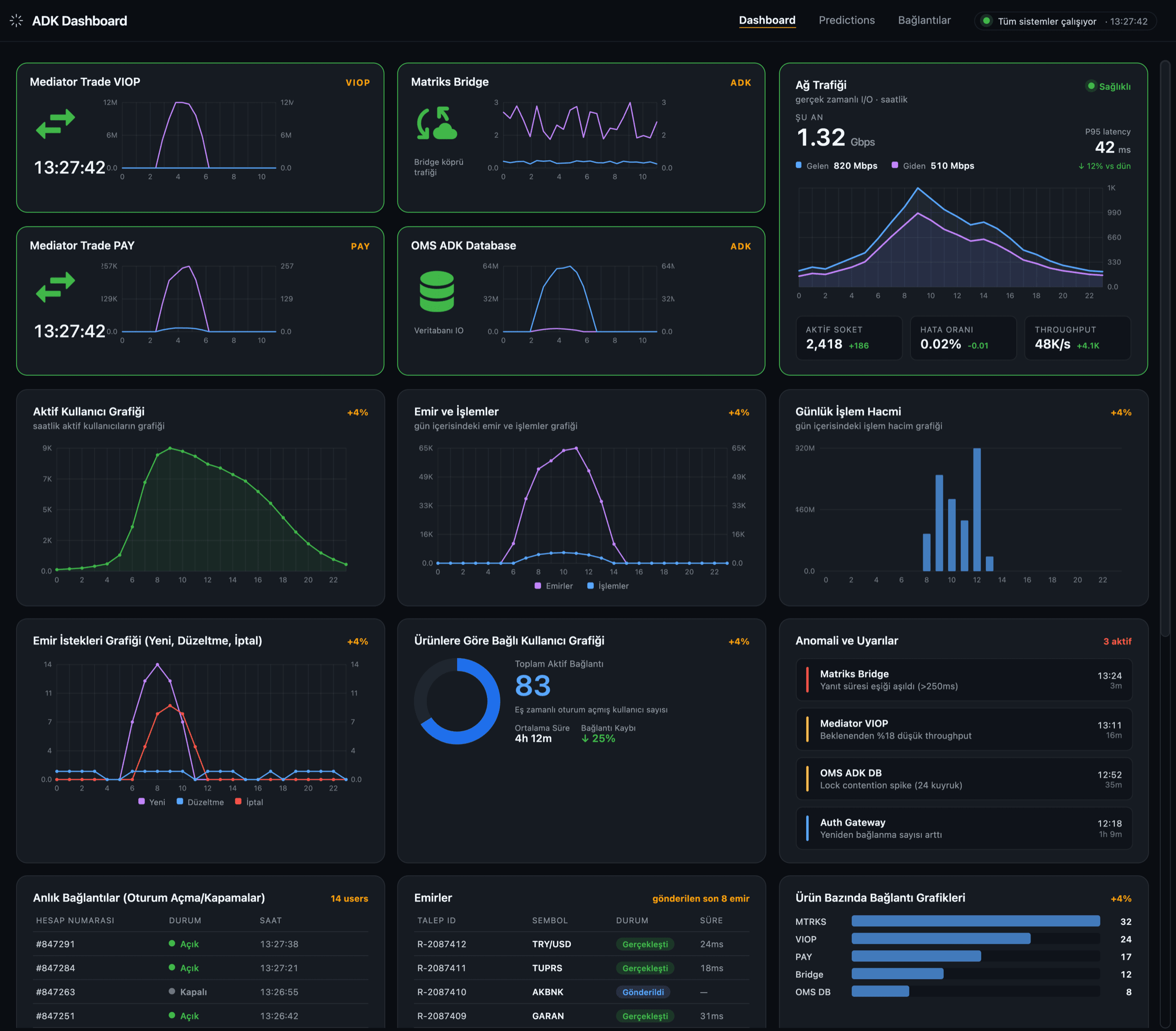
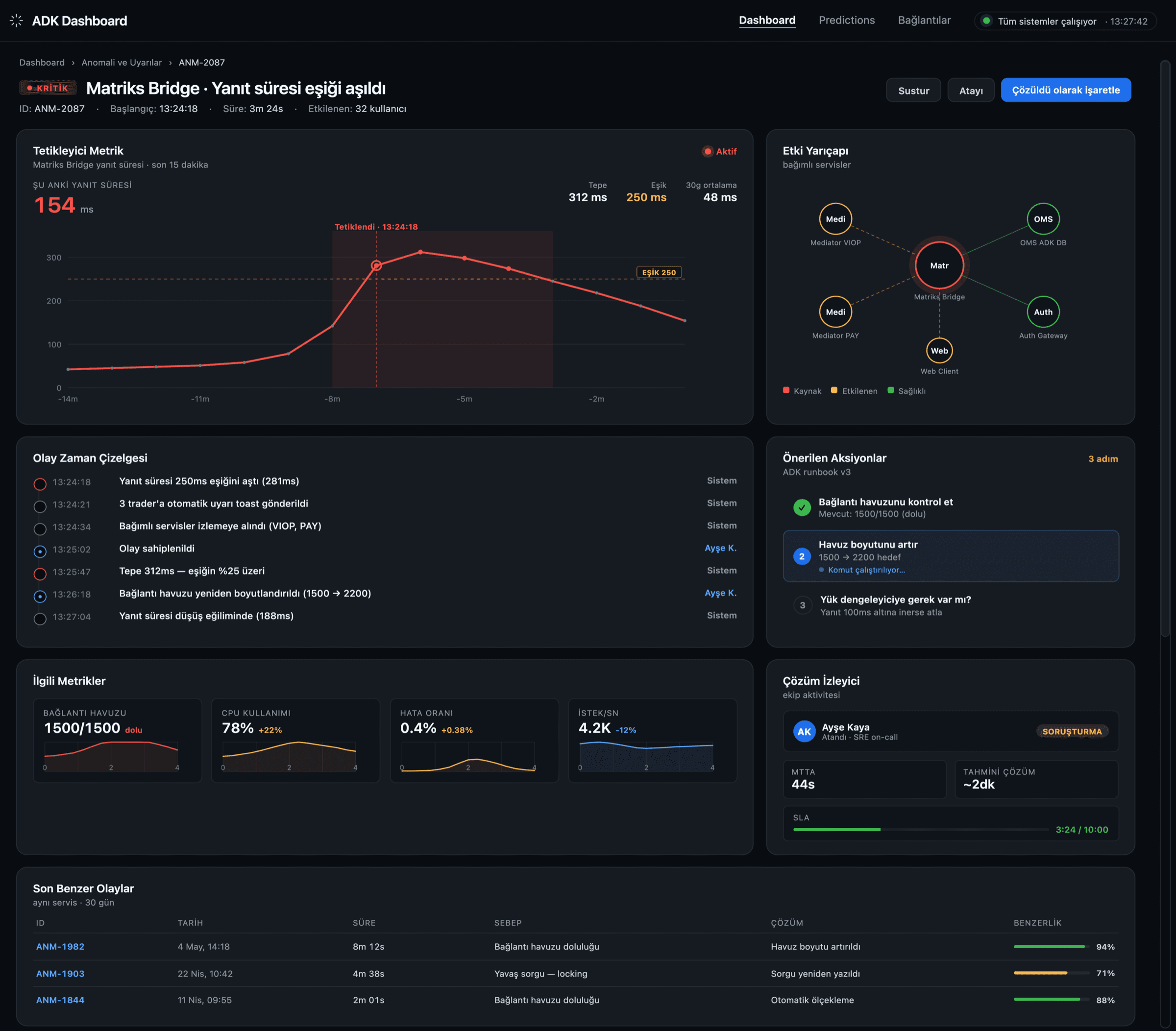
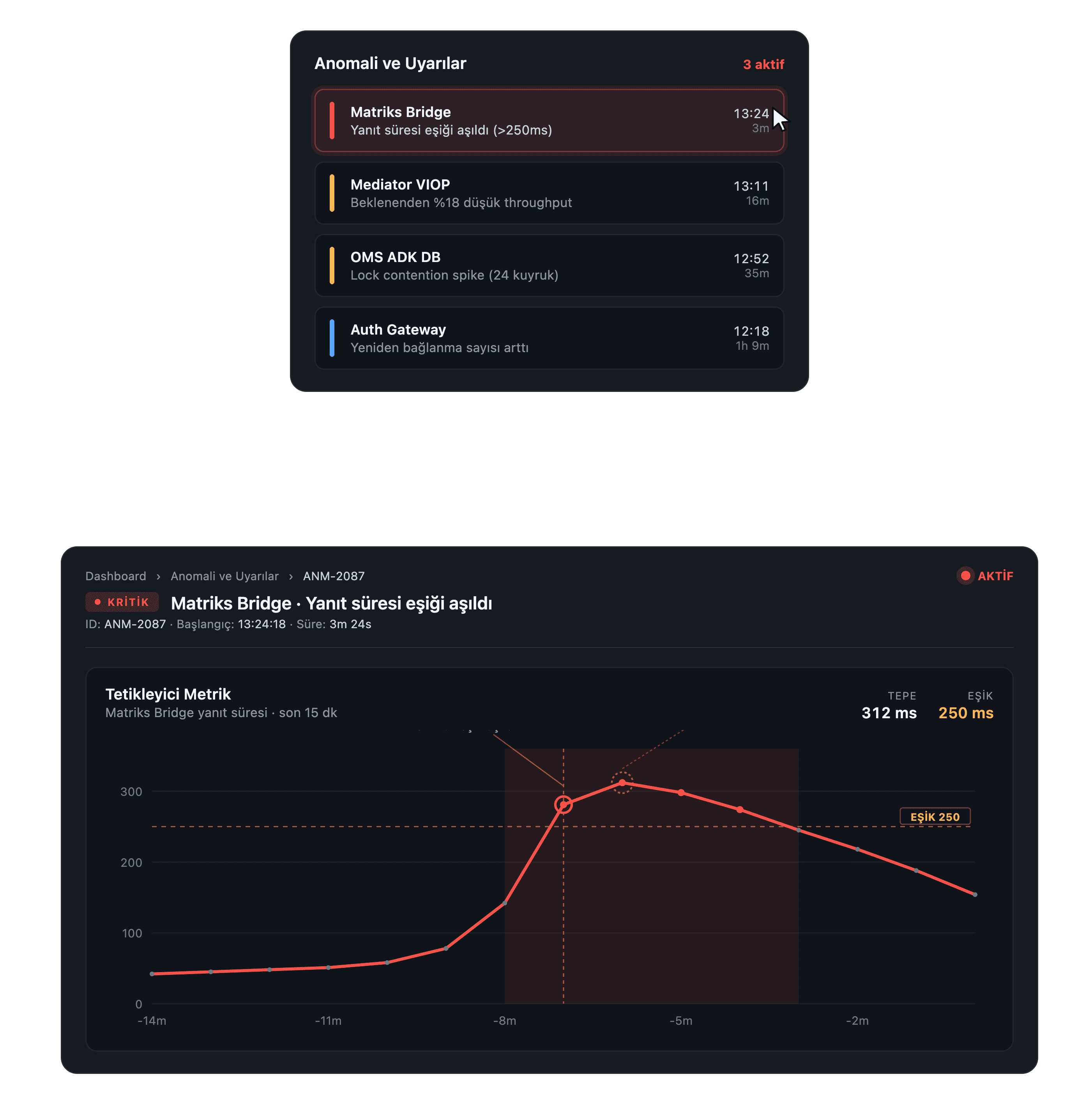
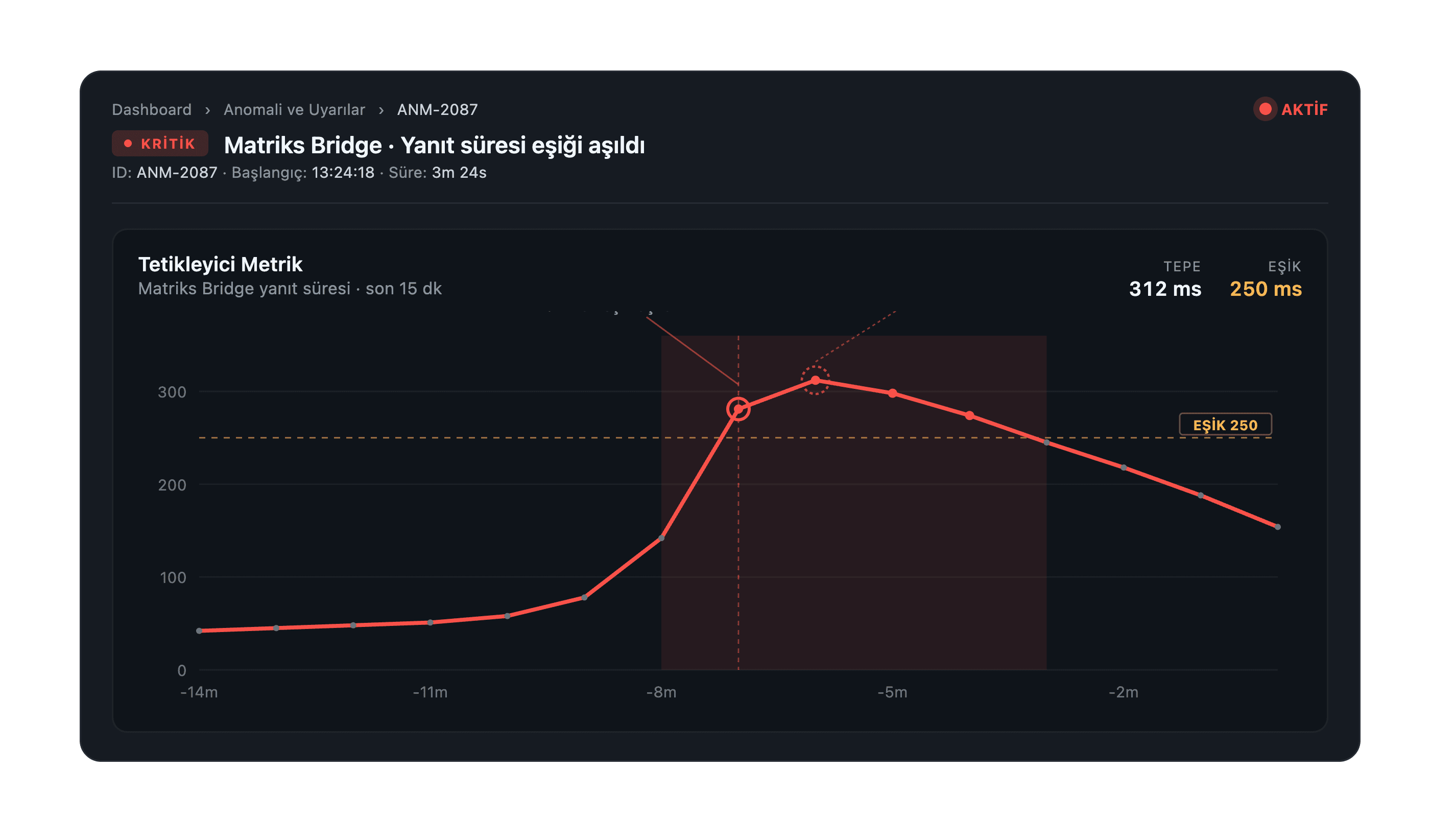
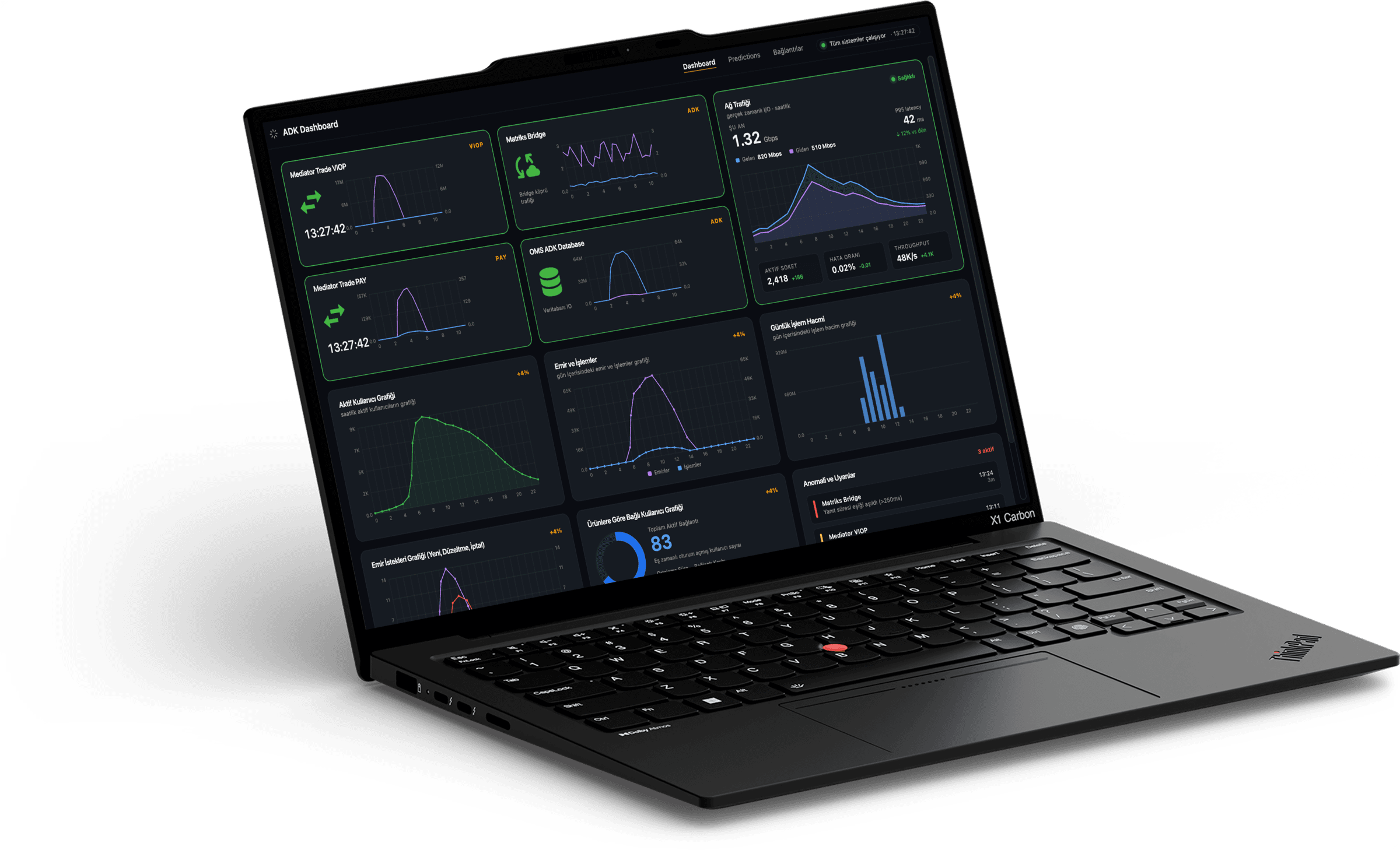
High-Frequency Trader · 9 yrs · İstanbul

“I don’t need the screen to talk. I need it to not lie when something breaks.”

Tech fluency9
Time pressure10
Tolerance for noise2
Customization need8

Goals

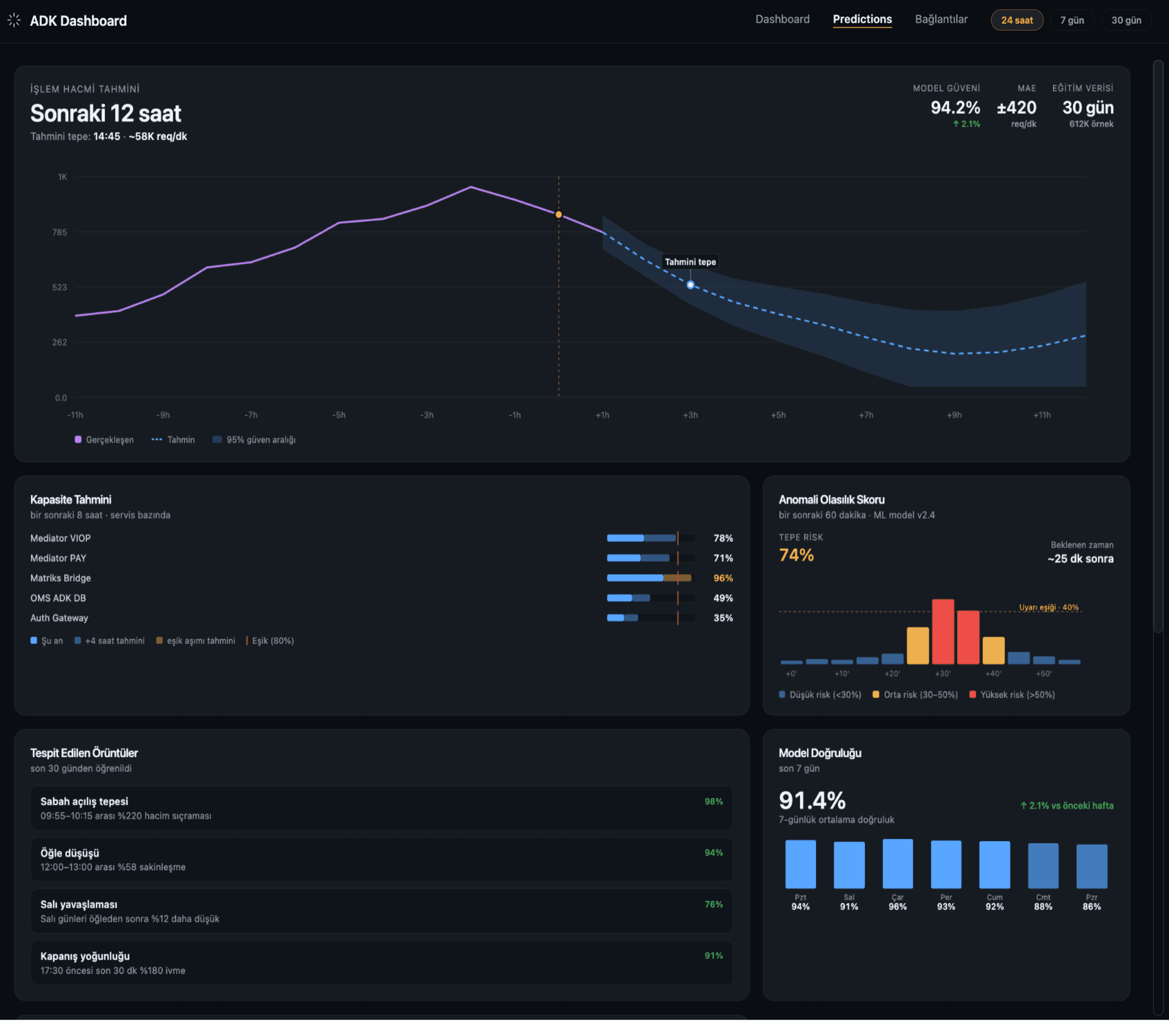
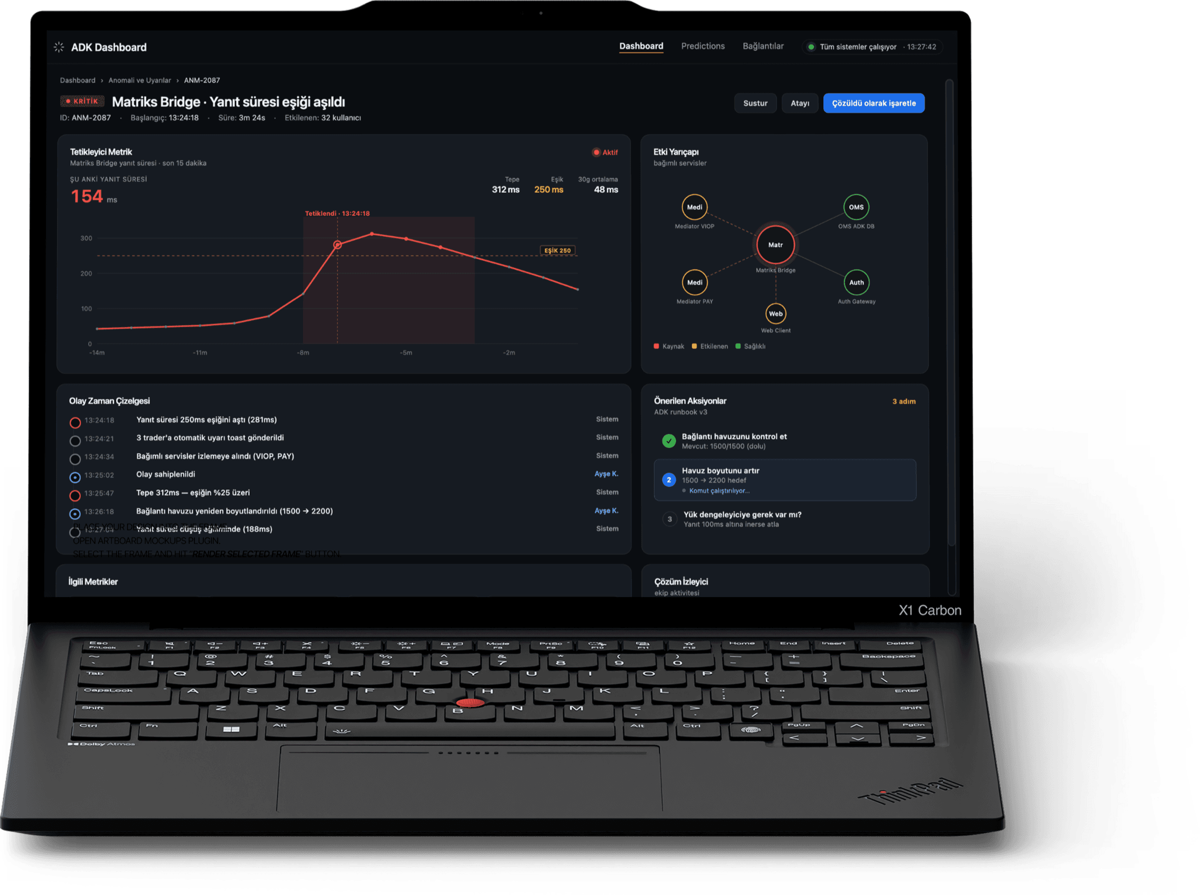
  • Zero-latency confirmation that the bridge is healthy
  • Pre-attentive cues (colour and shape, not text) for state
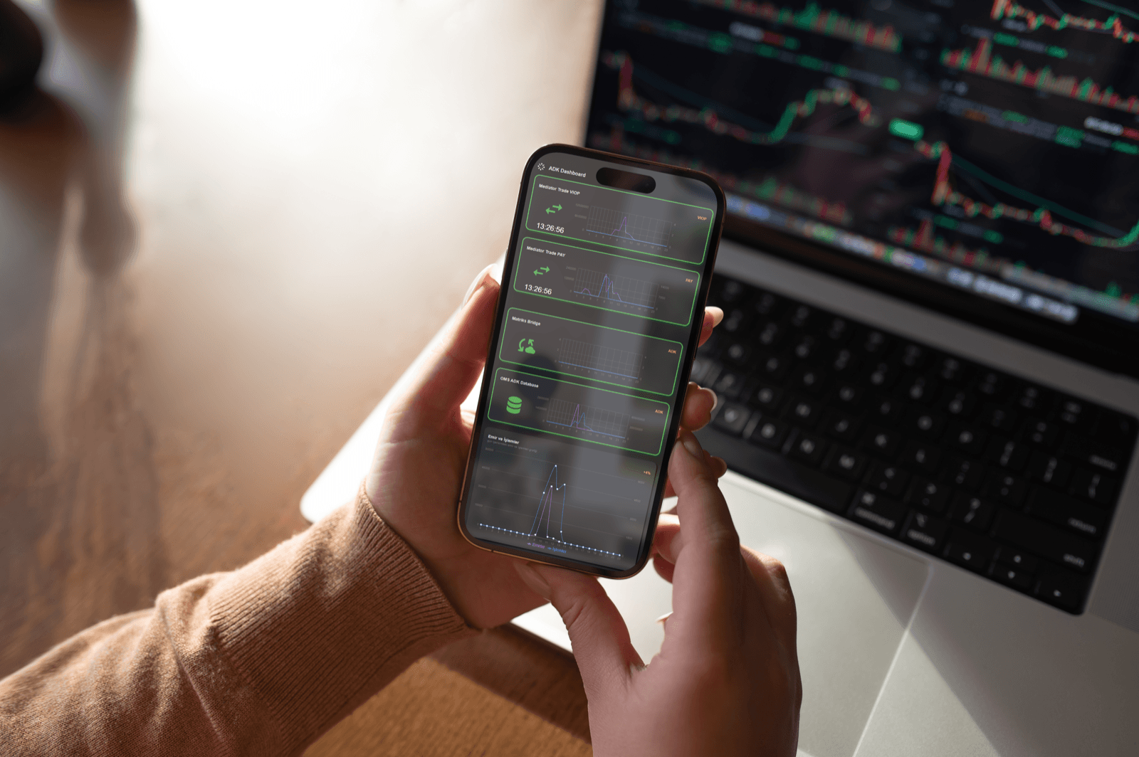
  • Same mental model on phone, even off-floor

Frustrations

  • Alerts arrive after the spike already happened
  • Tabs hide context; he loses the thread when he switches
  • No way to silence a noisy product without going blind to the others

Behaviour

  • 5 monitors, 11–13 h days, refreshes screen every ~9 s
  • Speaks to infra in fragments: “PAY just glitched, look”
  • Trusts his peripheral vision more than the UI

What success looks like

  • Glance < 1 s, decision < 3 s
  • “I don’t think about ADK during market hours.”
  • Phone surface that respects ringer-off etiquette
Persona 02 · The Investigator

Selin Aktaş, 41

Infrastructure Analyst · 14 yrs · Ankara

“By the time I find the incident in the logs, the next one is happening. Correlate it for me.”

Tech fluency8
Time pressure6
Tolerance for noise7
Need for history10

Goals

  • Correlate events across VIOP, PAY, Bridge and DB
  • Reach root cause without leaving the dashboard
  • Produce a clean post-mortem timeline within 24 h

Frustrations

  • Each product has its own log shape; she translates manually
  • Anomalies surface as numbers, not narratives
  • Compliance asks for evidence; she screenshots and stitches

Behaviour

  • 2–4 hour analytical deep dives, headphones on
  • Lives in the alerts panel, the table, and the chart overlay
  • Annotates with notes; current UI throws her notes away

What success looks like

  • “I can scrub back to the moment it broke.”
  • Audit trail is a feature, not a workaround
  • Predictions earn her trust by being explainable
04 · EmpathyPeak-hour state

Empathy map,
the trader,
09:50 to 10:10.

Captured in the twenty minutes around the Borsa Istanbul open, the loudest stretch of the morning. The session started calm, then VIOP volume spiked and the legacy dashboard went silent for forty-one seconds. This is what that felt like from the trader’s seat.

Says

Out loud,
to the room.

  • “Are you seeing PAY drop too, or is it just me?”
  • “Refresh, refresh, refresh, why is the chart frozen?”
  • “Just tell me if it’s our side or theirs.”
Thinks

Privately,
in real time.

  • If I miss this, my desk eats the loss, not the platform.
  • The green border isn’t honest; that thing has been ailing for ten minutes.
  • I have ninety seconds before compliance asks me what happened.
Does

With hands,
with eyes.

  • Refreshes the panel three times in nine seconds, triple his baseline rate.
  • Opens Slack, types a fragment, deletes it, opens phone instead.
  • Switches to two other tabs to triangulate a single state.
Feels

Underneath
all of it.

  • Anxious; the lag has happened before, on a bad day.
  • Distrust; the colour says fine, his gut says not fine.
  • Exhausted by 14:00 from staying alert to a screen that won’t be specific.
05 · SynthesisAffinity diagram

Eighty-four
frustrations,
four clusters.

Quotes, observations, and audit findings transcribed onto cards, then clustered until themes emerged. Four held: signal hierarchy, temporal blindness, recovery friction, and trust in automation. Everything I designed had to push against at least one of these.

① Signal hierarchy
“Everything is the same size, nothing pops.”
All cards have the same border weight, even when one is on fire.
No severity grammar; green / red is the only language.
“I’d rather see two big numbers than twenty small ones.”
② Temporal blindness
No way to scrub back to the moment it broke.
“I lost the spike because I blinked.”
Timestamps are missing on half the panels.
“What happened before what?” can’t be answered.
③ Recovery friction
Four tabs to triage one alert.
“Acknowledge” lives three menus deep.
No way to mute one product without muting all of them.
Logs and chart are on different surfaces.
④ Trust in automation
Predictions show a number; no one knows why.
“It cried wolf twice last month, so I stopped looking.”
Confidence intervals aren’t exposed.
Compliance can’t audit what the model decided.
06 · ReframeFrom pain to question

How might
we…

The four clusters became three working questions. Every screen I shipped had to defend itself against at least one of them. If a panel didn’t reduce a HMW, it didn’t earn its place.

HMW · 01

How might we surface critical signal without ever adding to the noise?

Maps to cluster ① + ③
HMW · 02

How might we make latency visible at a glance, and let an operator scrub backwards in time?

Maps to cluster ②
HMW · 03

How might we let traders trust the predictions the system makes about them?

Maps to cluster ④
07 · ProcessDesign thinking, applied

Not linear.
Looped.

I started with the d.school five-stage frame and bent it. Define and Ideate ran in parallel for the first three weeks; the problem kept clarifying every time a sketch hit the floor. Prototype and Test ran in a tight weekly loop with two ops desks for six weeks.

Weeks 1 to 3

Empathize

Floor shadowing, 11 interviews, socket replay sessions. Build the picture, not a solution.

Notion · Otter · Wireshark
Weeks 3 to 5

Define

Cluster 84 cards into 4 themes. Two personas. Three HMW questions that everything must answer.

FigJam · Affinity
Weeks 4 to 7

Ideate

Crazy 8s, layout studies, severity language, three lenses on the same hierarchy.

Paper · Figma
Weeks 6 to 11

Prototype

Lo-fi to hi-fi in three jumps. Real socket data into Figma via plugin. Component library built in lockstep.

Figma · React · Storybook
Weeks 7 to 13

Test

Weekly desk-side tests under live load. Three rounds. Each fed back into Define.

Maze · in-person
08 · JourneyA day with ADK

A trading day,
mapped end to end.

This is Emre’s day, anchored to a real Wednesday in March. The two emotional valleys (peak volume, anomaly event) are where the legacy interface failed loudest, and where the new design had to earn its keep.

Pre-market
08:30 – 09:30
Market open
09:30 – 10:00
Peak volume
10:00 – 11:30
Anomaly event
11:42
Resolution
11:42 – 12:10
Post-mortem
17:30
Action
Coffee, checks overnight queue depth, scans Predictions tab.
Watches first ten minutes; subscribes to four products.
Splits attention across VIOP/PAY/Bridge/DB; reacts to order flow.
PAY drops orders. Border turns red. Desk goes quiet.
Acknowledges alert, opens correlation, files note for compliance.
Replays the timeline with Selin, exports an annotated screenshot.
Thoughts
“Is anything different from yesterday?”
“Predictions said calm. Let’s see.”
“Latency drift on Bridge, is that real?”
“Is it us or them? I need to know in 10 s.”
“I want the receipts before they ask.”
“Could we have seen this earlier?”
Emotion
Pain points
No baseline; he carries it in his head.
Predictions can’t be audited.
Latency drift is invisible until catastrophic.
Severity colour is binary, no “ailing”.
Acknowledge lives three menus deep.
Screenshots aren’t a system of record.
Opportunities
Overnight summary on first paint.
Forecast band with explainable model.
Sparkline drift indicator at the card level.
Three-tier severity (idle / ailing / failing).
One-tap acknowledge with note capture.
Native timeline export for post-mortem.
09 · ArchitectureInformation model

Three surfaces.
One mental model.

Flattened the legacy IA from seven primary tabs down to three: Dashboard for “now”, Predictions for “next”, Connections for “who”. One responsive codebase carries the same three concepts across browser, phone, and the desktop installer; nothing has to be relearned between them. This case spotlights Dashboard and Predictions; Connections ships with the same chrome alongside.

ADK · root
DashboardNow

“Is anything wrong right now?”

Trade sources · VIOP · PAY · Bridge · DB
Network & throughput
Orders & transactions
Anomaly feed
Audit overlay
PredictionsNext

“What’s about to happen?”

Forecast band (24 h)
Anomaly model · explainability
Confidence intervals
Backtest archive
ConnectionsWho

“Who is on the platform?”

Live sessions table
Per-product connection charts
Login/logout stream
Role & access trace
One responsive web app · packaged for desktop, accessed on any screen.
Responsive webDesktop installer
10 · PrinciplesVisual language rules

Four rules that
survived testing.

Pinned to the wall above the desk for the full build. If a new screen disagreed with one of these, the screen was wrong.

01

Signal over noise.

A panel that doesn’t move only earns the bottom row. The screen rewards change, not status quo.

02

Colour means state.

Three tiers only: idle, ailing, failing. Brand colour is never spent on decoration.

03

Glanceable hierarchy.

One question answered per row. If a row needs a paragraph, the row failed.

04

Explain the model.

No prediction lives without a “why”. Confidence and inputs are part of the chrome, not a sub-page.

11 · DesktopThe shipped surface

The shipped
dashboard.

One screen, four critical sources at the top, secondary metrics below the fold, anomaly stream on the right rail. Severity colour is honest: green only when the system has earned it. Every card opens to a correlation drawer; every chart is scrubbable.

ADK Real-Time Monitoring dashboard: shipped production view with critical sources at the top, secondary metrics below the fold, and the anomaly stream on the right rail
12 · PredictionsLooking ahead

What the system
thinks is next.

A second surface alongside the dashboard, devoted to forecasting. The 24-hour hero plot shows actuals against the ML model’s prediction with a 95% confidence band. Capacity, anomaly probability, learned patterns, and pre-warned alerts all live one click from the live view.

The ADK predictions surface running on a laptop
ADK Predictions surface: 24-hour hero plot with actuals against the ML model prediction and 95% confidence band, plus capacity, anomaly probability, learned patterns, and pre-warned alerts
13 · AnomalyThe window and its details

When something
actually breaks.

One scrollable surface holds the entire investigation: trigger metric, blast radius, event timeline, runbook, related metrics, resolution tracker, and similar past incidents. The drilldown opens from the same surface that raised the alarm; the operator clicks the alert and the anomaly unfolds beneath. Same ID, same time window, no tab-hunting.

The ADK anomaly detail surface running on a laptop
ADK anomaly detail surface: trigger metric, blast radius, event timeline, runbook, related metrics, resolution tracker, and similar past incidents on one scrollable view
How the operator reaches it
ADK dashboard with alert landing in the anomaly stream
01Alert lands in dashboard
Anomaly widget on hover, showing the trigger preview
02Preview opens
Anomaly drilldown, full detail surface
03Drilldown opens
Idle

All systems green.

Border at 1px in #3FB950. Sparkline neutral. Used sparingly; green is a promise, not a default.

Ailing

Drifting from baseline.

Border 2px #F7B955. Sparkline highlights the divergence. No alert sound; visual only.

Failing

Operator must act.

Border 2px #F85149, ambient screen rail pulses once, alert lands in the right rail with one-tap acknowledge.

14 · ResponsiveSame web, every screen

One surface,
any viewport.

Mobile was never a separate app. The dashboard was built responsive from the first wireframe; the same React components reflow from desktop grid to a single mobile column at the md breakpoint, with the same tokens and severity grammar. Desktop ships as a packaged installer running the same web build.

The ADK dashboard rendered on a phone in a browser, alongside the same product running on a laptop in the background.
Responsive contract
  • One codebase. No separate native app. The same React surface adapts from a desktop grid to a single column, with the same components.
  • Critical first. Below the md breakpoint, the four trade sources stack vertically before any secondary panel; the fold lands at the first non-trade card.
  • Same tokens. Severity colours, type ranks, and chrome carry across breakpoints without override. What you read on the desk reads the same in the browser on the phone.
  • Touch-first targets. Hit areas widen below tablet width. Hover-only affordances collapse into tap; acknowledge is a single tap, not a menu.
15 · ImpactMeasured post-launch

What it earned
in production.

Twelve weeks after launch, across six institutional ops desks, against the legacy baseline. Wall-clock and survey-derived; the operator quotes carry the rest.

Median time-to-detect
−61%
38s14.7s

38 s baseline to 14.7 s after launch. The operator sees the failure before the desk feels it.

3.2×
Faster issue triage
1 drawer
4 tabs collapsed to a single correlation drawer.
92%
Operator confidence (CSAT)
58%92%
From a 58% baseline. Survey, n = 41, 6 desks.
−47%
Support tickets (infra)
beforeafter
The “where do I see X?” tickets, gone.
Qualitative · operator quotes

“I stopped checking the screen when nothing was wrong. That’s the highest compliment I can give a dashboard.

Emre, HFT desk · 8 weeks post-launch

Qualitative · analyst quotes

“The post-mortem used to take a day. It’s a screenshot and a paragraph now.

Selin, Infra Analyst · 6 weeks post-launch

16 · ReflectionLooking back

What it had
to earn back.

A live financial product punishes vague design. ADK had to be specific.

The problem was never how it looked. Operators had stopped trusting what the screen told them, and the design had to earn that trust back.